How much validity based on empirical evidence and demonstrated over the past 100 years in the USA is there for the Trickle Down Theory of economics? What percentage specifically goes from the top ten percent of income earners in respect to tax breaks or stock margins or any other fiduciary advantages compared to the bottom ten percent of people by income in America? This blog will explore the validity of this theory and the actual gains made or lost by lower income people when it comes to tax cuts. I will apply some of the Deming theory and logic that I learned during my years of working with Dr. W. E. Deming and his philosophy. I have also relied on my AI assistant Metis for help in compiling some of the data.
I. Opening: The Promise vs. the Measured Reality
Define trickle-down in operational terms:
Tax cuts at the top → investment → productivity → wage growth → broad prosperity
Pose the testable question:
Has this causal chain been empirically demonstrated?
Transition:
In quality terms, this is a theory that must be evaluated against data.
II. A Deming Lens: Turning Ideology into a Testable System
Apply Deming:
Theory of Knowledge: What does trickle-down predict?
Operational Definition: “Trickle” must show measurable income/wage gains at the bottom.
System Flow: Where do the gains move after tax cuts?
Variation: Who actually receives the benefits?
Define metrics:
- Distribution of tax benefits by decile
- Wage growth at the bottom vs. asset growth at the top
- Investment vs. shareholder payouts
III. The Empirical Record: Growth, Wages, and Inequality
Cross-National Evidence (1965–2015)
Modern empirical research finds:
- Major tax cuts for the rich increase income inequality
- No statistically significant effect on economic growth or unemployment
- Interpreted by researchers as evidence against trickle-down
Systems translation:
The predicted system output (broad growth) does not appear.
IV. U.S. Post-2017 Evidence
Observed outcomes:
- Large gains to corporations and investors
- Modest wage and investment effects relative to the size and cost of the tax cuts
- Significant portion of gains flowed to shareholder payouts (buybacks, dividends) rather than broad wage growth
Important nuance:
Some benefits do reach below the top—but not at the scale required to validate the theory.
V. The Distribution Test: Who Gets the First-Round Gains?
State the key methodological point:
There is no single stable “top-10 to bottom-10 transfer percentage” across 100 years because policy design and definitions of “benefit” vary.
However, we can measure:
The share of total tax-cut value accruing to each income group.
VI. Treasury Distribution: Extending TCJA Provisions
Percent distribution of tax change by income decile:
- Bottom 10%: 0.0% (rounded)
- Top 10%: 59.5%
- Top 0.1%: 15.6%
Interpretation:
- The majority of direct benefits are top-loaded
- The bottom receives effectively none in first-round tax relief
Systems translation:
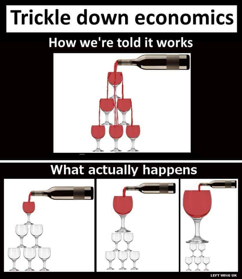
This is a funnel, not a trickle.
VII. Tax Policy Center Snapshot (2018 House Version)
Share of total federal tax change:
- Top quintile: 56.7%
- Lowest quintile: 1.3%
Even though this is quintiles (not deciles), the direction is clear:
Most of the measurable tax benefit accrues high in the income distribution.
VIII. Flow Analysis: Where the Money Actually Goes
Trace the system path:
- Financial Channels
- Stock buybacks
- Dividends
- Asset price appreciation
These primarily benefit:
- High-income households
- Concentrated asset owners
- Limited Wage Transmission
- Capital gains ≠ wage gains
- Productivity increases are not evenly shared
- Labor’s share of income has declined relative to capital
- Structural Leak Points
- Global capital mobility
- Automation
- Concentrated equity ownership
Metaphor:
The “trickle” enters a reservoir owned by the same group.
IX. Historical Pattern (High-Level)
Brief, non-data-heavy narrative:
- 1920s: Top-heavy tax cuts → inequality spike
- Post-WWII high top rates → strong middle-class growth
- 1980s onward → rising wealth concentration
- 2000s–2010s → asset growth outpaces wage growth
Frame as:
Policy design correlates with distributional outcomes.
X. Systems Failure Analysis (Deming Table)
| Failure Mode | Description |
| Faulty theory | Assumes capital gains automatically become wages |
| Misaligned incentives | Firms reward shareholders first |
| Measurement error | GDP growth ≠ shared prosperity |
| Ignoring variation | Gains concentrated by geography & sector |
| Suboptimization | Financial markets optimized, labor markets not |
Conclusion:
The system performs as designed—for capital accumulation.
XI. Counterarguments and Fair Consideration
Acknowledge:
- Investment can increase under tax cuts
- Retirement accounts hold equities
- Some job creation occurs
Evaluate magnitude vs. distribution:
- Timing (immediate top gains vs. delayed bottom effects)
- Risk exposure (market volatility borne by workers indirectly)
- Scale of benefit relative to cost
XII. What Actually Lifts the Bottom (Evidence-Based)
Policies with stronger bottom-decile effects:
- Earned Income Tax Credit
- Direct transfers
- Tight labor markets
- Education and health investment
- Infrastructure employment
Frame:
Build-up vs. trickle-down.
XIII. PDSA Cycle for Economic Policy
Apply Deming explicitly:
Plan: Tax cuts for the rich to raise wages
Do: Implement policy
Study:
- Top 10% receive ~60% of benefits
- Bottom 10% ≈ 0% first-round
- No significant growth effect
Act: Revise theory or redesign system
XIV. Closing: The Verdict After a Century
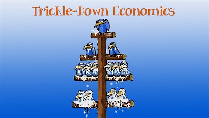
- “After a century of measurement, the trickle evaporates before reaching the ground.”
- “This is not a leaky system; it is a directed flow.”
- “In quality terms, trickle-down fails the operational definition test.”
Should we continue to optimize a theory that fails its own metrics?
“Trickle-down” isn’t a single formal theory so much as a claim: if you reduce taxes (or otherwise boost after-tax returns) for high-income people and capital owners, enough of the benefit will flow to everyone else via higher investment, productivity, and wages.
What the empirical record says (broadly)
Across modern empirical work, the evidence is weak to negative for the core trickle-down promise:
- A major cross-country study of “major tax cuts for the rich” (1965–2015) finds they raise income inequality but show no significant effect on economic growth or unemployment—results the authors interpret as evidence against trickle-down.
- For the U.S. specifically, post-2017 analyses often find the corporate/investor-side gains were large, while broad wage/investment effects were modest relative to the size/cost of the cuts (and many benefits showed up as shareholder payouts like buybacks rather than broad wage growth).
That doesn’t mean nobody below the top benefits from any tax cut—many do—but the “it will substantially lift the bottom because it lifts the top” claim has not held up well.
There is no single, stable “percentage that goes from the top 10% to the bottom 10%” across 100 years, because it depends on which policy (and how you define “benefit”: tax cuts, transfers, wages, wealth gains, etc.).
What we can measure cleanly is the share of total tax-cut benefits that accrue to each income group in a given policy.
A concrete, well-documented example: extending the expiring TCJA provisions (Treasury distribution table)
The U.S. Treasury’s distribution analysis for full extension of expiring TCJA individual/estate provisions reports the “Percent Distribution” of the tax change by income decile:
- Bottom 10% (0–10th percentile): 0.0% of the total tax change (rounded)
- Top 10% (90–100th percentile): 59.5% of the total tax change
So in that major “keep the tax cuts” scenario, about ~60% of the total tax-cut value goes to the top decile, and ~0% to the bottom decile (rounding matters, but the qualitative point is unchanged).
For additional context from the same table:
- Top 0.1% alone: 15.6% of the total tax change
Another corroborating distribution snapshot (Tax Policy Center, TCJA as passed by House Ways & Means; 2018)
TPC reports the share of total federal tax change by income groups (in quintiles). In 2018 (in that House version):
- Top quintile: 56.7% of the total federal tax change
- Lowest quintile: 1.3%
That’s not bottom decile, but it points the same direction: most of the measured tax-cut value accrues high in the distribution.
What this implies about “trickling down” over time
Putting the empirical findings together with distribution tables:
- The direct, first-round benefits of tax cuts tilted to high incomes/capital are heavily top-weighted (often dramatically so).
- The second-round effects that would need to be large for “trickle-down” to be true (big investment surge → big productivity growth → big wage growth) are generally found to be too small or too uncertain to offset the inequality channel in the observed record.
Bottom Line
The Trickle Down Theory is BULLSHIT designed for suckers. P. T. Barnum said, “There is a sucker born every day.” The simple answer here is that Americans are being suckered by the rich and their political lackeys to believe that making the rich even richer will somehow benefit them. It will not. It never has and it never will. You have a better chance of winning the lottery. Your odds there are fixed at 1 in 292,201,338.

